ggplot(mpg)
One of the most widely used package for data visualization in R is called ggplot2 (https://ggplot2.tidyverse.org). It has a bit of a learning curve but it is extremely powerful and can visualize almost anything. The R for data science book by Wickham and Grolemund (2016) has a chapter on ggplot2, and the same author also wrote an entire book on ggplot2 (Wickham 2016) , which I also recommend. The book Data visualization: a practical introduction book by Healy (2018) is another good resource. These books cover a lot of ground on how to write code to visualize data in R, but ultimately, an understanding of of the fundamentals of data visualization (what does a good visualization look like?) is also an invaluable asset for you as a data scientist. For that, I recommend the Fundamentals of data visualization book by Wilke (2019). Another wonderful resource is the R Graph Gallery website, which contains a large collection of ggplot graph examples that include the code so you can easily use it in your own scripts.
This chapter draws from these resources to provide a short introduction to visualizing data with ggplot2. First, we will explore the ggplot syntax, and then explore different types of visualizations with some examples and some exercises. Like most of the other packages that we used so far, there is a ggplot 2 cheatsheet that can be useful for a quick reference.
The minimum requirements to make a plot is data, an aesthetic argument aes(), and a geometric object geom(). Just like the pipe (%>%) is used to build R statements layer by layer, ggplot follows the same principle but uses the plus sign “+” to add layers to the plot. Let’s construct a basic dot plot to see how it works.
This is the starting point. We tell ggplot what object contains the data that we want to visualize.
ggplot(mpg)
Telling R to just plot the data produces nothing because we did not provide information on the dimensions of the graph (x and y axis) or how to show the data in the graph.
We can use aes() to tell R what variables we want to use for the x and y axes.
ggplot(mpg) +
  aes(x=displ, y=hwy)
The provided aes() were used by ggplot to generate a blank plot. We now need to tell how we want the data to be visualized in this plot with a geom() layer.
The geom_ function family allow you to specify how you want the data to be displayed on the graph. There are often called layers and you can have multiple layers in a single figure.
ggplot(mpg) +
  aes(x=displ, y=hwy) +
  geom_point()
That’s it! Now you know how to make a plot in R. Let’s look at a few more examples on adding layers and making our graph look better. First, let’s add a second geom() layer on top of this graph to make it more informative.
ggplot(mpg) +
  aes(x=displ, y=hwy) +
  geom_point() +
  geom_smooth()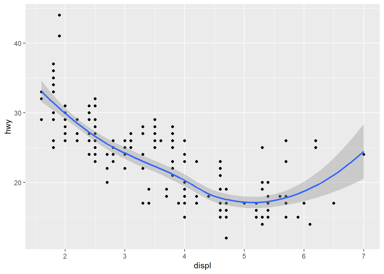
ggplot(mpg) +
  aes(x=displ, y=hwy) +
  geom_point() +
  geom_smooth() +
  labs(x = "Engine displacement (litres)",
       y = "Highway miles per gallon",
       title = "Mileage by engine size and cylinders",
       subtitle = "Source: http://fueleconomy.gov")
`geom_smooth()` using method = 'loess' and formula = 'y ~ x'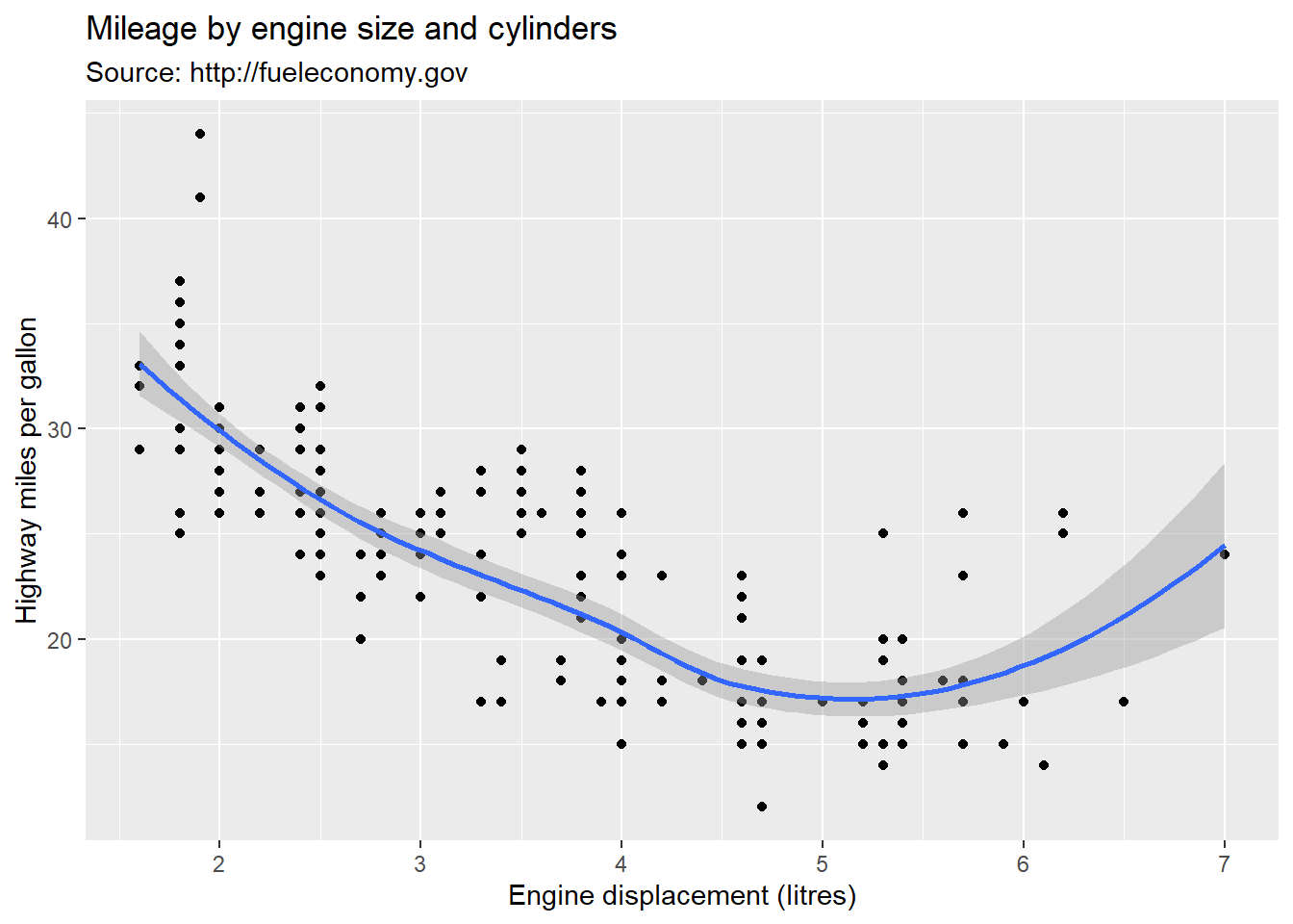
in ggplot, you can modify the layout of your graphs with themes. There are standard themes available that you can use like this:
ggplot(mpg) +
  aes(x=displ, y=hwy) +
  geom_point() +
  geom_smooth() +
    labs(x = "Engine displacement (litres)",
         y = "Highway miles per gallon",
         title = "Mileage by engine size and cylinders",
         subtitle = "Source: http://fueleconomy.gov") +
  theme_classic()
`geom_smooth()` using method = 'loess' and formula = 'y ~ x'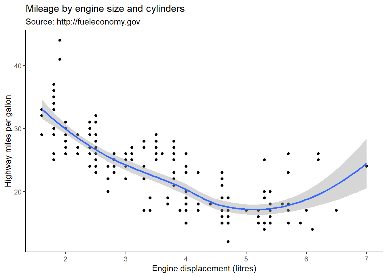
There are a lot of things you can modify and a whole range of possible arguments for the theme() function. The best way to find out how to do what you are trying to do will often be a Google search, or the theme() documentation that you can view in RStudio ?theme(). For example, if we wanted our legend to be at the bottom of the graph, center the title, and make it bigger, we could do it like this:
ggplot(mpg) +
  aes(x=displ, y=hwy) +
  geom_point(aes(colour=class)) +
  geom_smooth() +
  labs(x = "Engine displacement (litres)",
       y = "Highway miles per gallon",
       title = "Mileage by engine size and cylinders",
       subtitle = "Source: http://fueleconomy.gov") +
  theme_classic() +
  theme(legend.position = "bottom") +
  theme(plot.title = element_text(size = 20, hjust = .5))
`geom_smooth()` using method = 'loess' and formula = 'y ~ x'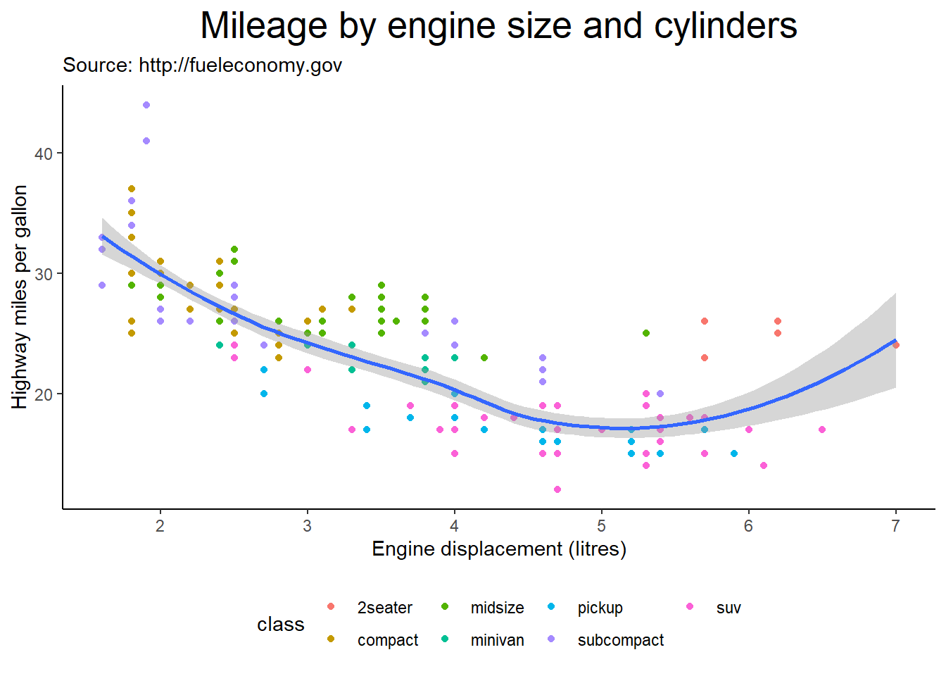
We can specify the color of our geoms.
ggplot(mpg) +
  aes(x=displ, y=hwy) +
  geom_point(colour = "green") +
  geom_smooth(colour = "red") +
  labs(x = "Engine displacement (litres)",
       y = "Highway miles per gallon",
       title = "Mileage by engine size and cylinders",
       subtitle = "Source: http://fueleconomy.gov") +
  theme_classic()
`geom_smooth()` using method = 'loess' and formula = 'y ~ x'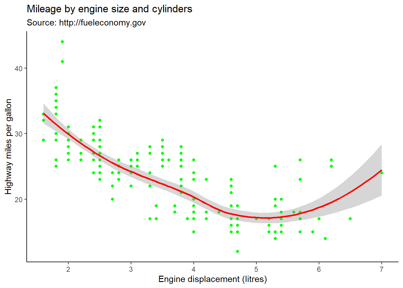
Perhaps we’d rather have the colour be based on a variable in the dataset. In this case the colour goes into an aes() function within the geom_point() function. like this:
ggplot(mpg) +
  aes(x=displ, y=hwy) +
  geom_point(aes(colour=class)) +
  geom_smooth() +
    labs(x = "Engine displacement (litres)",
       y = "Highway miles per gallon",
       title = "Mileage by engine size and cylinders",
       subtitle = "Source: http://fueleconomy.gov") +
  theme_classic()
`geom_smooth()` using method = 'loess' and formula = 'y ~ x'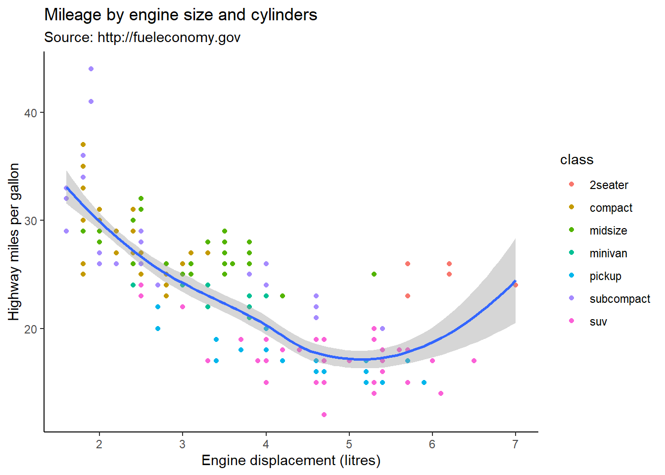
You can customize the colours in your graphs by using one of many palettes provided by different packages. Here is a great place to explore palettes and where to get them: <https://emilhvitfeldt.github.io/r-color-palettes/discrete.html>. In the following example, I use the colorblind palette from the ggthemes package.
# First I load the ggthemes package
library(ggthemes)
Warning: package 'ggthemes' was built under R version 4.3.2ggplot(mpg) +
aes(x=displ, y=hwy, colour=class) +
geom_point() +
labs(x = "Engine displacement (litres)",
y = "Highway miles per gallon",
title = "Mileage by engine size and cylinders",
subtitle = "Source: http://fueleconomy.gov") +
scale_color_colorblind()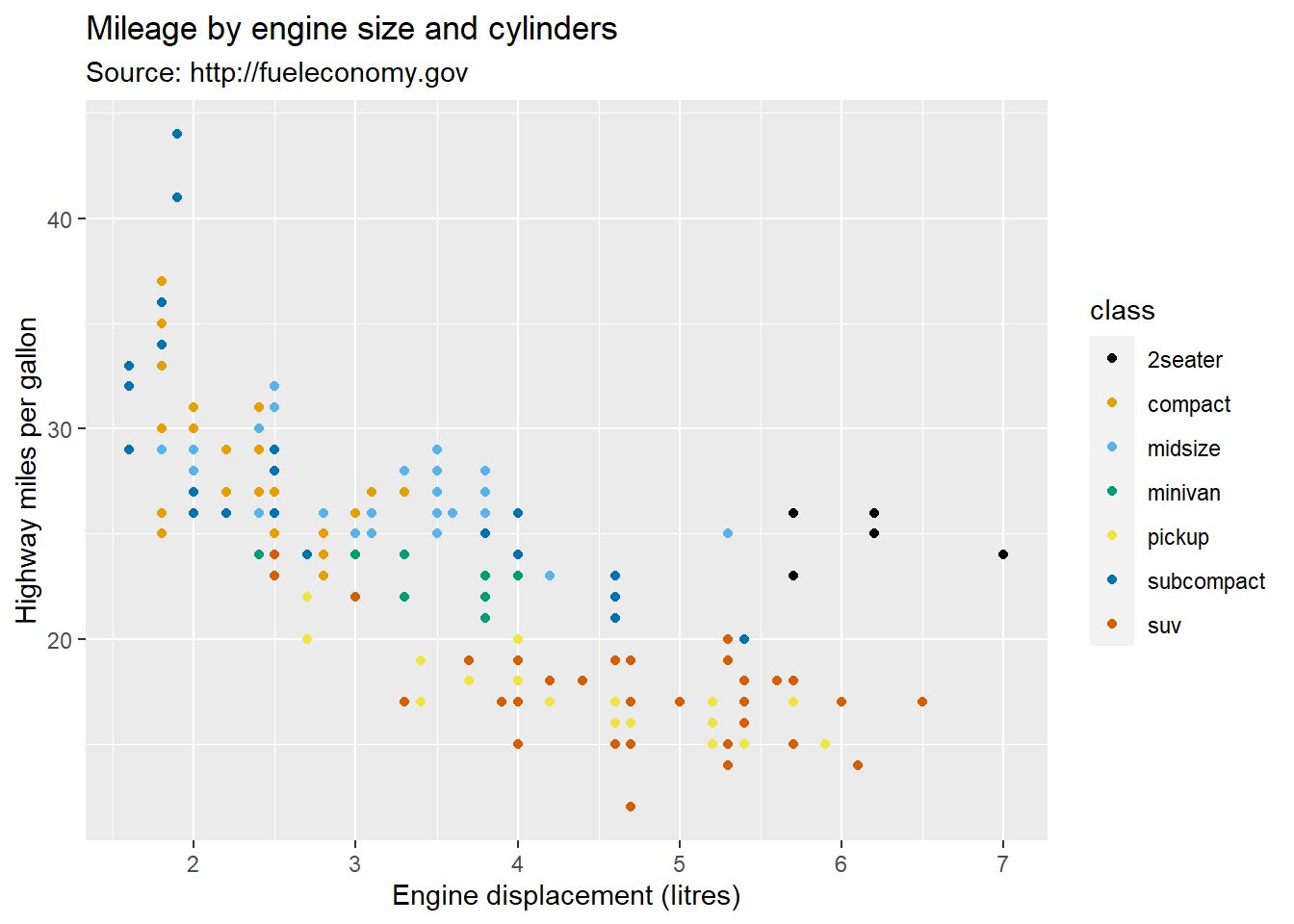
Here’s how you can specify the colours using scale_colour_manual(), or scale_fill_manual() when working with continuous variables.
ggplot(mpg) +
  aes(x=displ, y=hwy, colour=class) +
  geom_point() +
  labs(x = "Engine displacement (litres)",
       y = "Highway miles per gallon",
       title = "Mileage by engine size and cylinders",
       subtitle = "Source: http://fueleconomy.gov"
  ) +
  scale_color_manual(values = c("blue","red","green","yellow","purple","orange","pink"))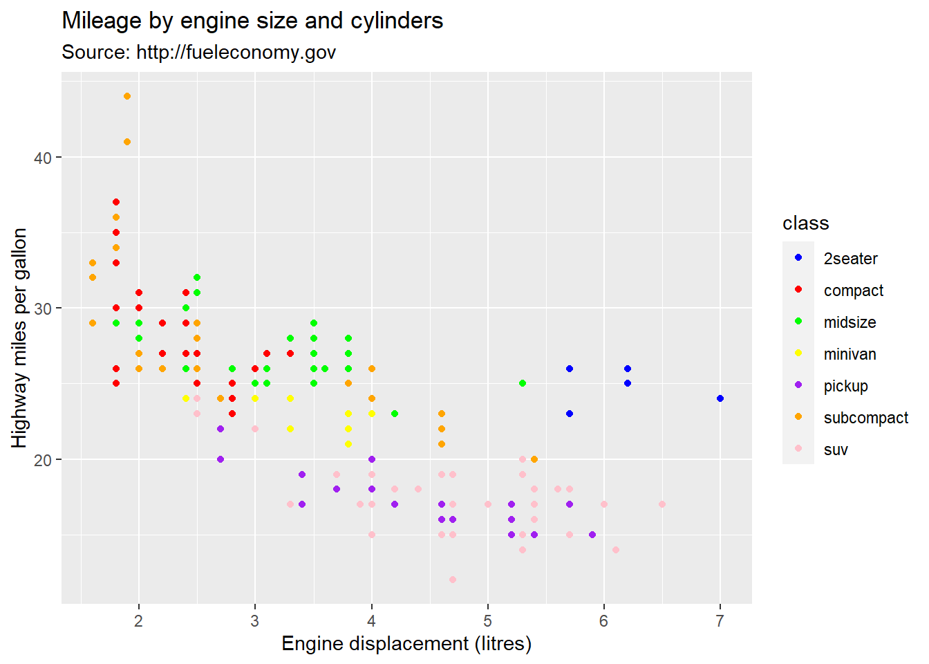
The code above assigned assigned the colors in order (first group has first colour, second group as second colour, etc.). You can also specify the group colors like this:
ggplot(mpg) +
  aes(x=displ, y=hwy, colour=class) +
  geom_point() +
  labs(x = "Engine displacement (litres)",
       y = "Highway miles per gallon",
       title = "Mileage by engine size and cylinders",
       subtitle = "Source: http://fueleconomy.gov"
  ) +
  scale_color_manual(values = c("2seater" = "pink",
                                "suv"="red",
                                "minivan" = "green",
                                "pickup" = "yellow",
                                "compact" = "blue",
                                "subcompact" = "orange",
                                "midsize"="purple"))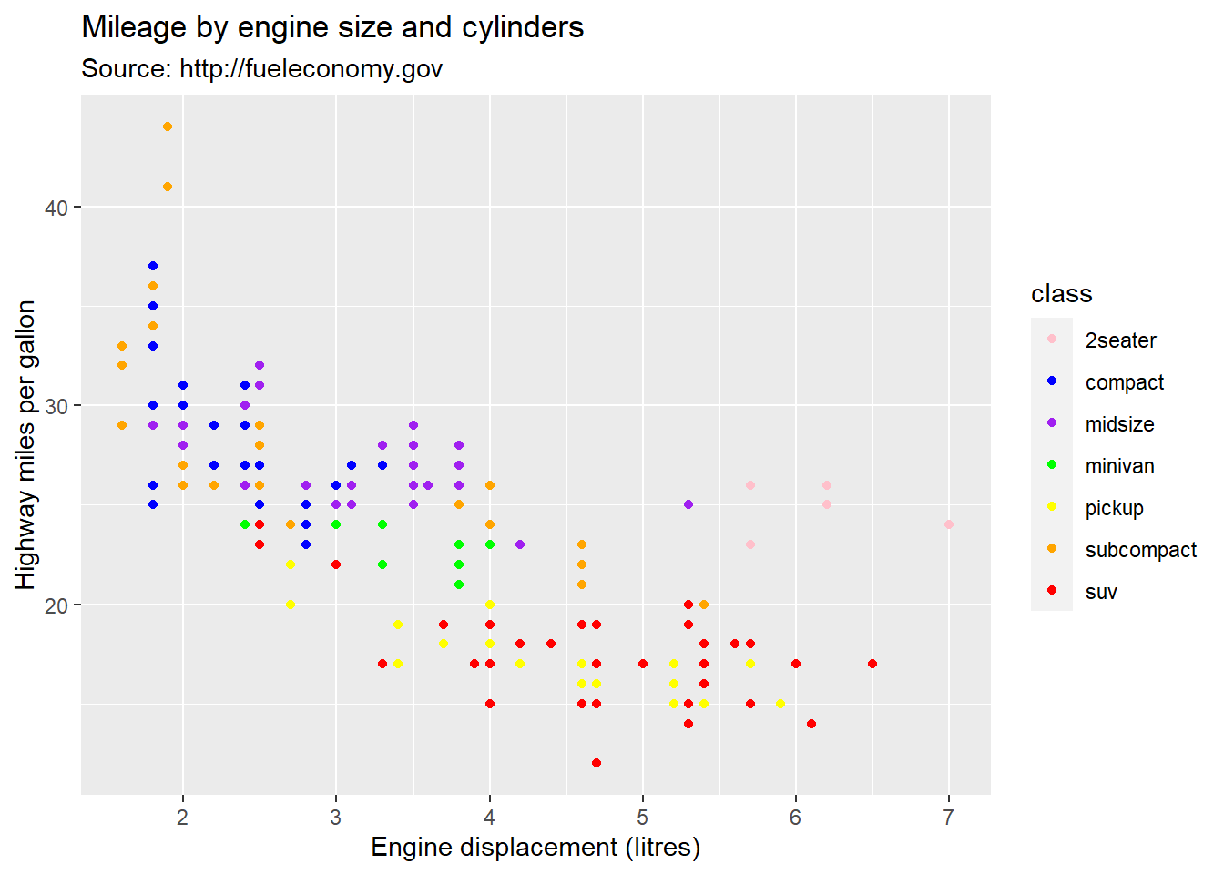
We can adjust the limits and breaks of our axis with scale_x_continuous() and scale_y_continuous(). The limits arguments needs two value (the start and the end of the axis) and the breaks argument is a vector of the value labels you want to show on the axis.
ggplot(mpg) +
  aes(x=displ, y=hwy) +
  geom_point(aes(colour=class)) +
  labs(x = "Engine displacement (litres)",
       y = "Highway miles per gallon",
       title = "Mileage by engine size and cylinders",
       subtitle = "Source: http://fueleconomy.gov") +
  theme(legend.position = "bottom") +
  theme(plot.title = element_text(size = 20, hjust = .5)) +
  scale_x_continuous(limits = c(0,10), breaks = c(0,2,4,6,8,10)) +
  scale_y_continuous(limits = c(0,100), breaks = c(0,20,40,60,80,100))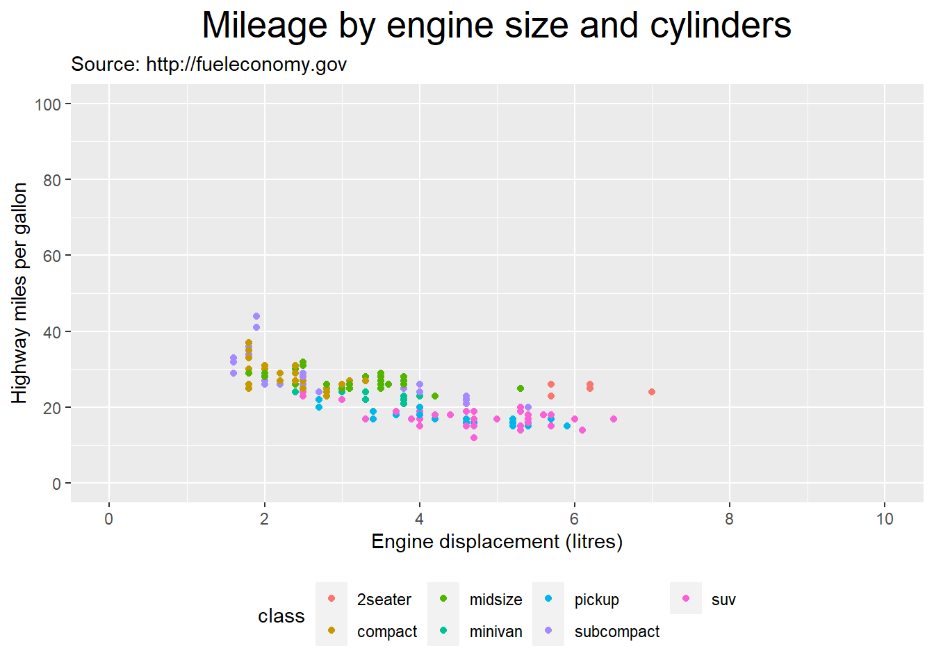
The ggplot2 website provides a comprehensive list of the geoms and all the other functions that you can use with ggplot. You can can also click on any function listed to get more information, including the arguments that the function accepts or requires, as well as an example.
As you will see, there is a lot of things that you can do with ggplot. That’s because ggplot is meant to fulfill the needs of a large community of users working in completely different industries with completely different kinds of data and completely different objectives. Ideally, when you are attempting to visualize your data, you already have a pretty clear idea of what the data looks like and what you are trying to accomplish, so you can start by asking these few questions, so that you can identify the limited set of options that are relevant for your data and your goals. Figuring out your options “on paper” before jumping in the code will help guide you and protect you from information overload and potentially a lot of wasted time trying to create plots using geoms that simply do not work for you data. Here are the questions:
What question am I trying to answer with this plot?
How many variables do I want to visualize?
What type of variables do I want to visualize?
The directory of visualizations proposed by Wilke (2019) is a great resource to help you think about this. You can also use the following table that lists geoms based on the number and types of data to be plotted.
Mapping of graph types to data number and types
| Variables | Typical graph |
|---|---|
| Single discrete/categorical | Bar chart |
| Single continuous | Histogram |
| two continuous | Scatter plot, line graph |
| Two discrete/categorical | Bar chart |
| One discrete/categorical, one continuous | Bar chart, box plot, dot plot |
As we saw in chapter 6, categorical variables can often best represented with frequency tables. Put simply, a bar chart is nothing more than the visual representation of a frequency table. So let’s look at our categorical and discrete variables to see which ones we might want to visualize with a bar chart. The only categorical variables that we should really avoid visualizing with a bar chart are those with too many possible values, so let’s count the number of possible values for each of our categorical variables.
mpg %>%
  pivot_longer(cols = c("manufacturer","model","trans","drv","fl","class"),
               names_to = "variable",
               values_to = "value") %>%
  select(variable, value) %>%
  unique() %>%
  group_by(variable) %>%
  summarize(possible_value = n()) %>%
kbl()| variable | possible_value |
|---|---|
| class | 7 |
| drv | 3 |
| fl | 5 |
| manufacturer | 15 |
| model | 38 |
| trans | 10 |
These are all reasonable amounts of possible values, so all the variables are good candidates for bar charts. Let’s use ggplot to make a bar chart representing the frequency of observations for each manufacturer in the mpg dataset.
ggplot(mpg) +
  aes(manufacturer) +
  geom_bar()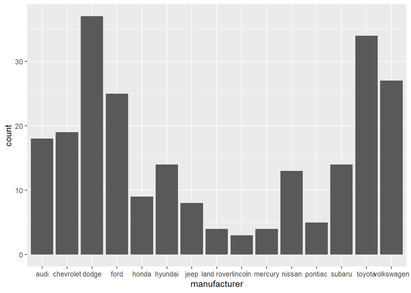
We can see that the names of the manufacturers overlap, so let’s fix that by giving a 45 degree angle to these labels.
ggplot(mpg) +
  aes(manufacturer) +
  geom_bar() +
  theme(axis.text.x = element_text(angle = 45))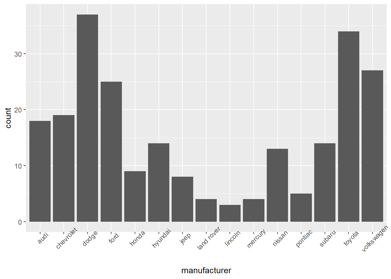
ggplot(mpg) +
  aes(hwy) +
  geom_histogram()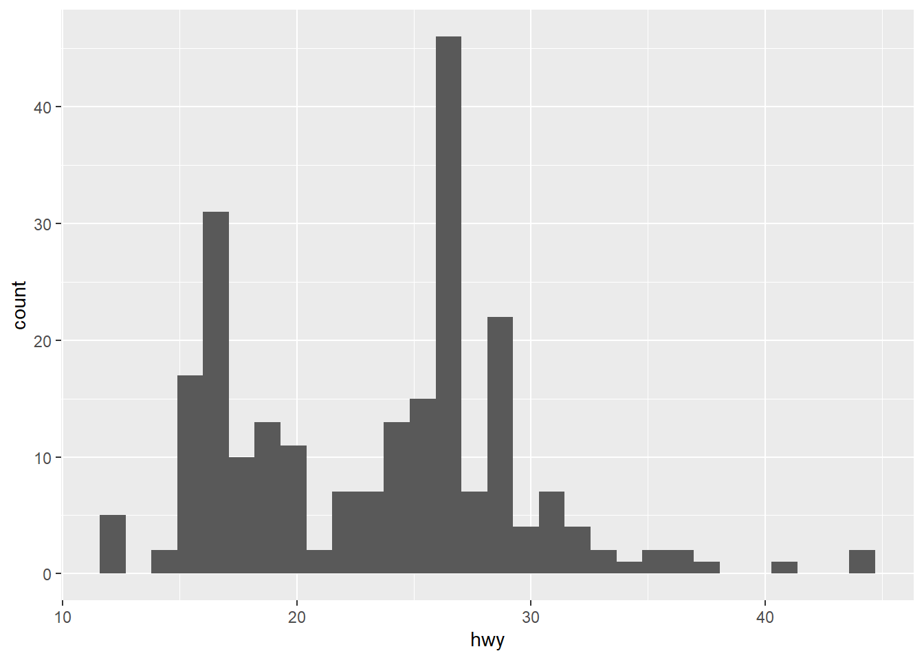
The example we used earlier happens to be a good example of a scatter plot on which we added a trend line with the geom_smooth function.
ggplot(mpg) +
  aes(x=displ, y=hwy) +
  geom_point(aes(colour=class)) +
  geom_smooth(method = "loess")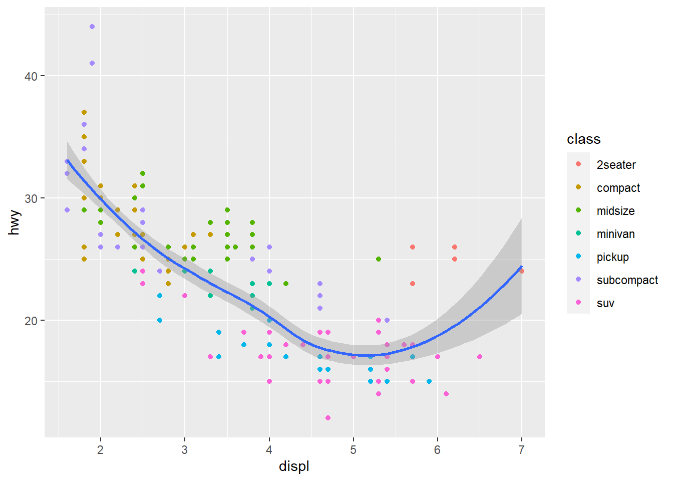
ggplot(mpg) +
  aes(x=hwy, y=cty) +
  geom_line() +
  ylab("Miles per gallon (city)") +
  xlab("Miles per gallon (highway)")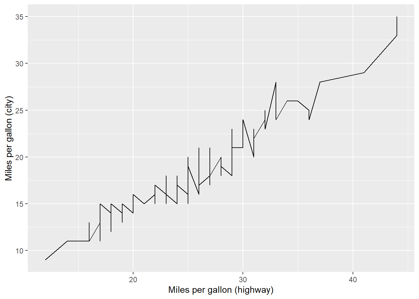
mpg %>%
  select(manufacturer, cyl) %>%
  mutate(cyl = as.character(cyl)) %>%
  group_by(manufacturer, cyl) %>%
  mutate(count = n()) %>%
  ggplot() +
  aes(x=manufacturer, y=count, fill=cyl) +
  geom_bar(position="dodge", stat="identity") +
  theme(axis.text.x = element_text(angle = 45))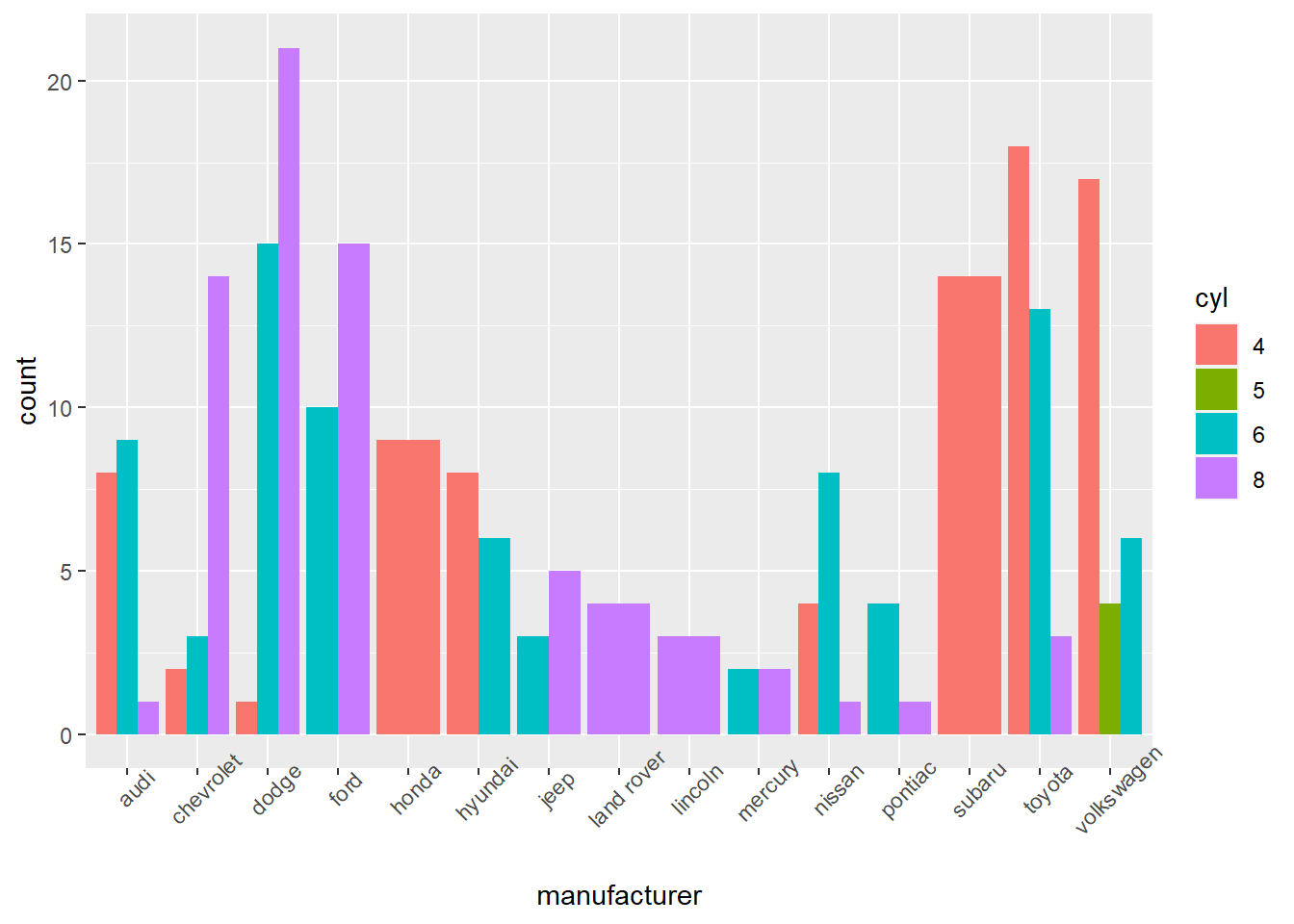
The previous example isn’t looking too great. Maybe if we stacked the bars? We only have to make one change to the code: geom_bar(position = "stack") instead of “dodge”.
mpg %>%
  select(manufacturer, cyl) %>%
  mutate(cyl = as.character(cyl)) %>%
  group_by(manufacturer, cyl) %>%
  mutate(count = n()) %>%
  ggplot() +
  aes(x=manufacturer, y=count, fill=cyl) +
  geom_bar(position="stack", stat="identity") +
  theme(axis.text.x = element_text(angle = 45))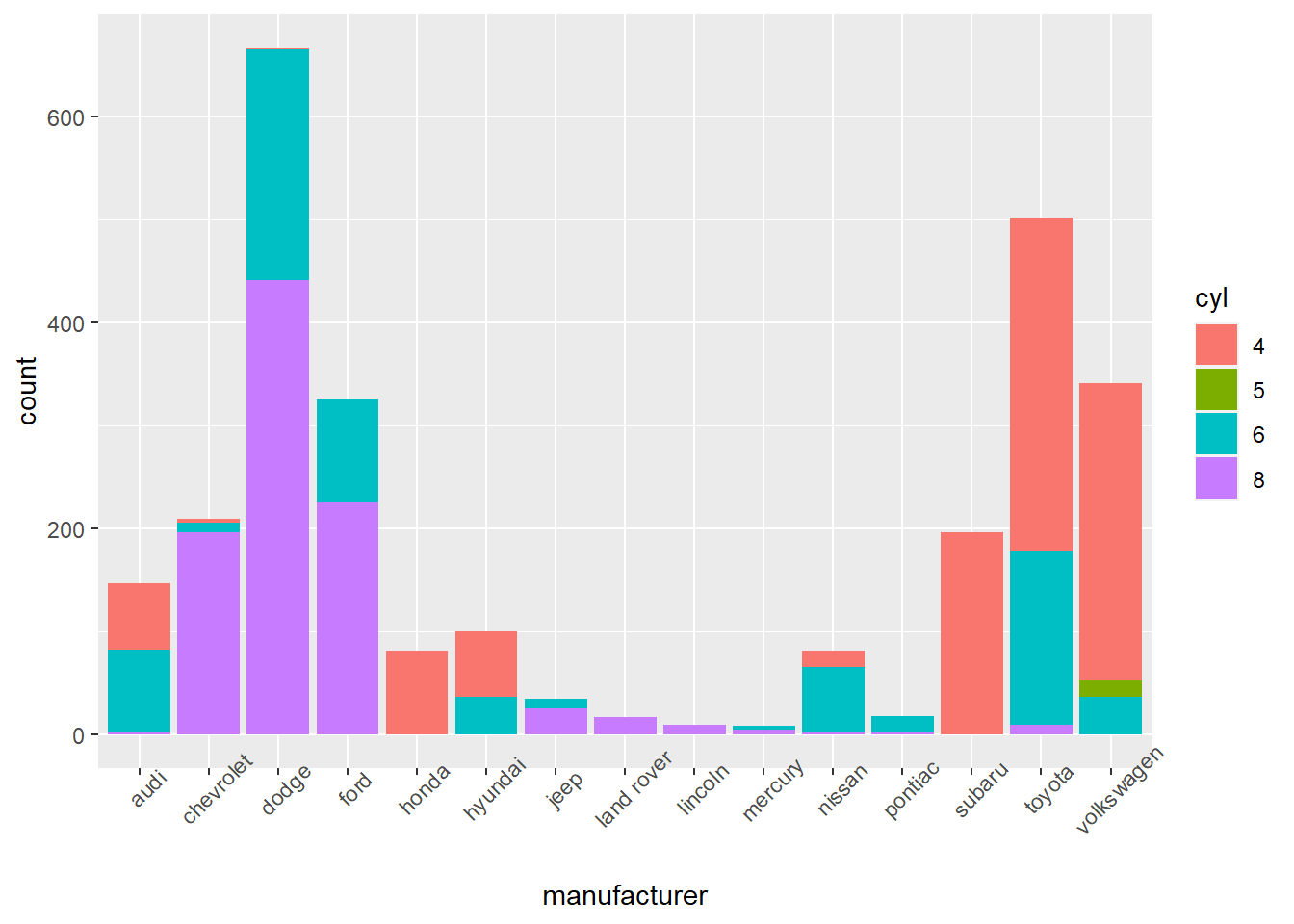
We can easily do a percent stacked bar chart by changing the position argument of the geom_bar() to “fill”.
mpg %>%
  select(manufacturer, cyl) %>%
  mutate(cyl = as.character(cyl)) %>%
  group_by(manufacturer, cyl) %>%
  mutate(count = n()) %>%
  ggplot() +
  aes(x=manufacturer, y=count, fill=cyl) +
  geom_bar(position="fill", stat="identity") +
  theme(axis.text.x = element_text(angle = 45))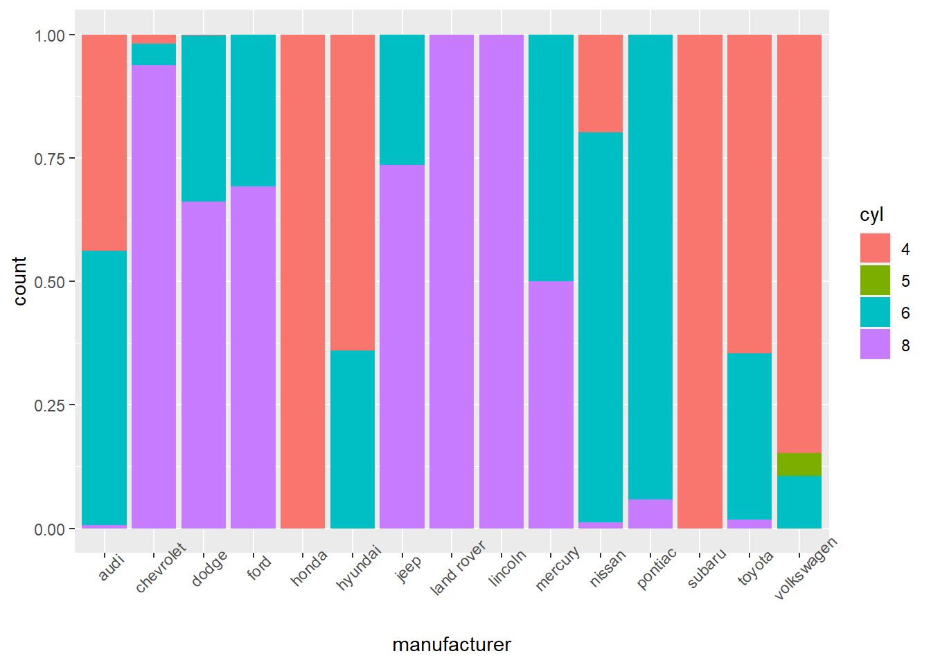
Let’s use a box plots to compare the miles per gallon performance of cars on the highway depending on the number of cylinder of the motor. As you can see in the code below, the cyl variable needs to be converted to a char (or a factor) otherwise ggplot treats it as a numerical variable instead of a categorical variable.
ggplot(mpg) +
  aes(x=as.character(cyl), y = hwy) +
  geom_boxplot() +
  theme(axis.text.x = element_text(angle = 45))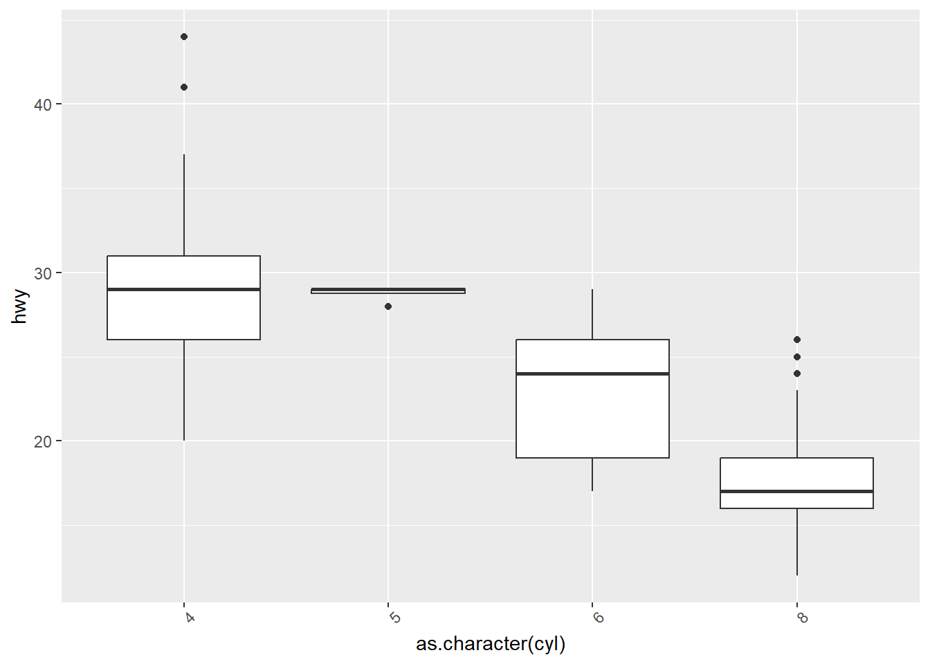
Let’s try the same thing with a jitter plot.
ggplot(mpg) +
  aes(x=as.character(cyl), y = hwy) +
  geom_jitter(width=0.2)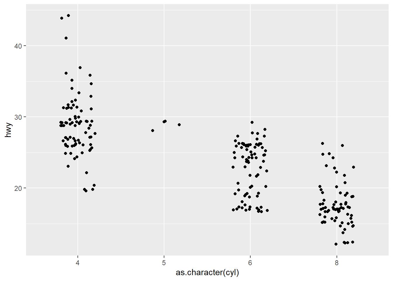
You can add the jitter plot on top of the box plot!
ggplot(mpg) +
  aes(x=as.character(cyl), y = hwy) +
  geom_boxplot() +
  theme(axis.text.x = element_text(angle = 45)) +
  geom_jitter(width=0.2)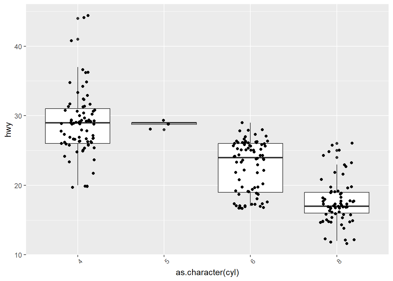
You may want to produce a distinct plot for each of your groups in order to have more space to show your data. For instance, the plot above is a vertical display of 4different distributions. It’s space efficient and makes it easy to compare the distributions, but maybe you have space and would rather show a panel of 4 distributions using histograms, for instance. This is done with the facet_grid() and facet_wrap() functions. Here’s an example with facet_wrap().
mpg %>%
  mutate(cyl = as.character(cyl)) %>%
ggplot() +
  aes(hwy) +
  geom_histogram() +
  facet_wrap(facets = "cyl", ncol=2)
`stat_bin()` using `bins = 30`. Pick better value with `binwidth`.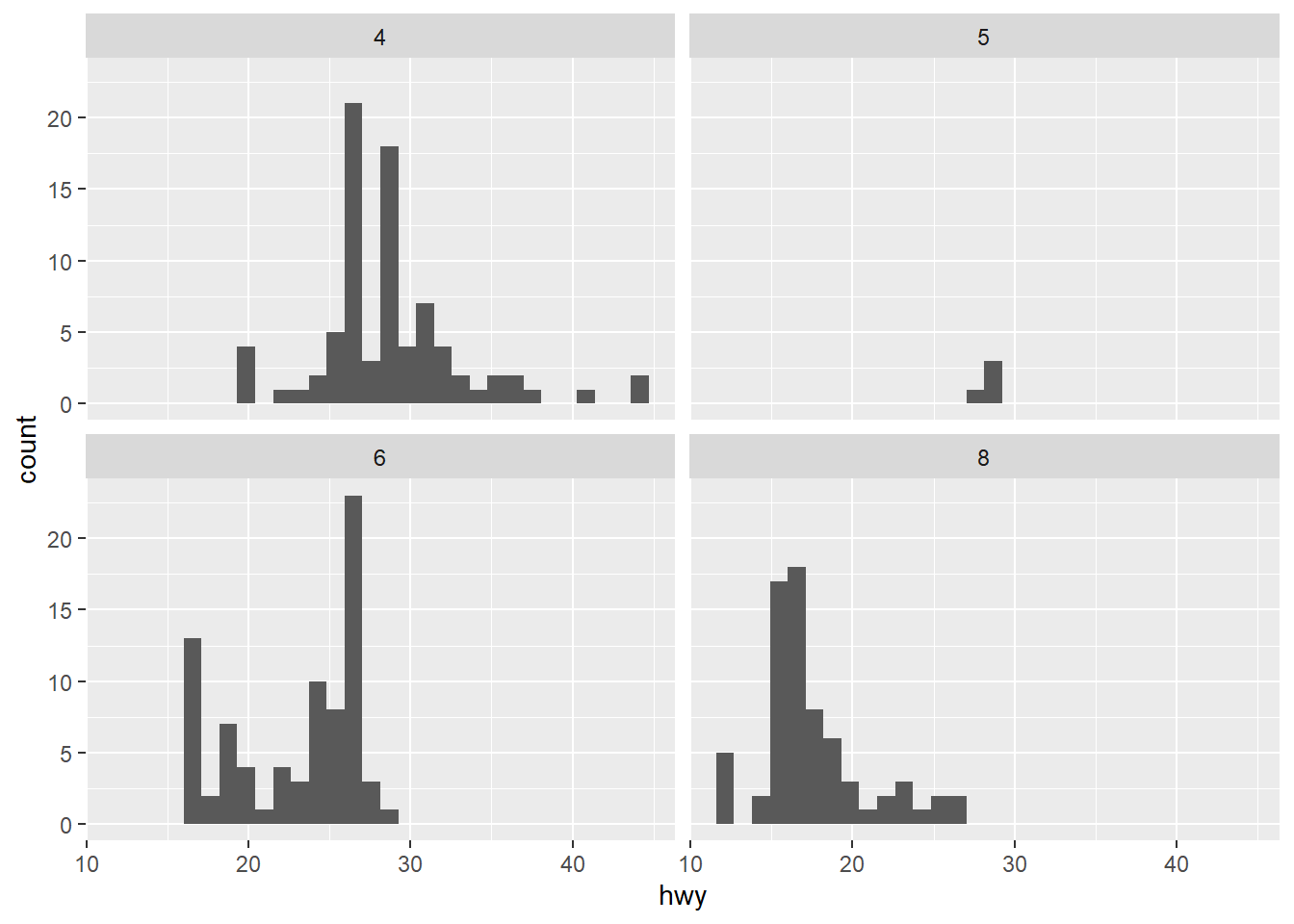
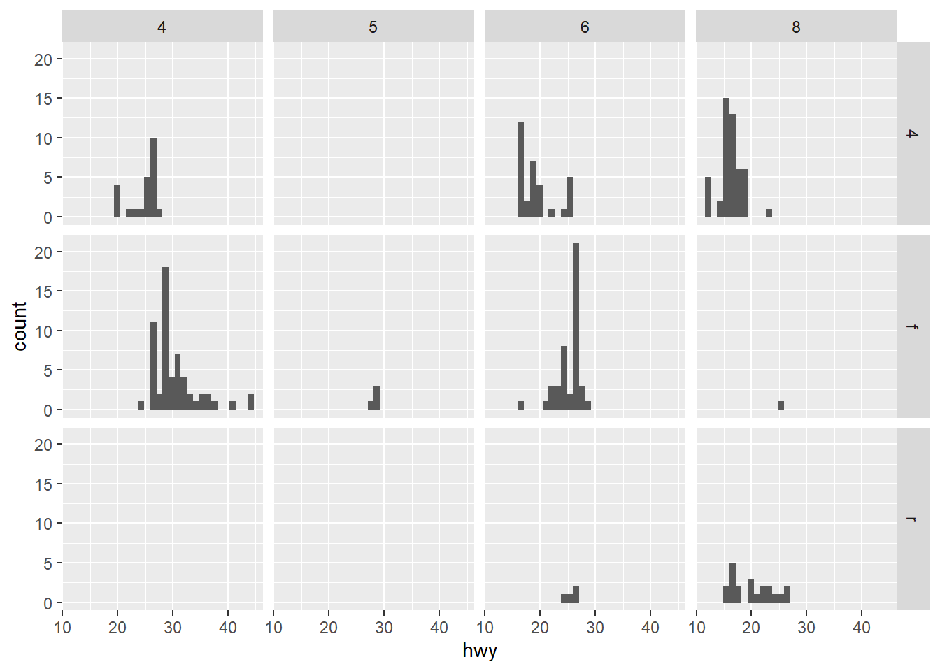
We can use variables to position my facets with facet_grid(). For example, the cyl variable has four possible values (4,5,6,8) and the drv variable as three possible values (4, f, r). I can use those variables to create a 4x3 grid of histograms.
mpg %>%
  mutate(cyl = as.character(cyl)) %>%
ggplot() +
  aes(hwy) +
  geom_histogram() +
  facet_grid(cols = vars(cyl), rows = vars(drv))
`stat_bin()` using `bins = 30`. Pick better value with `binwidth`.