12 Visualizing multiple variables
12.1 Learning objectives
By the end of this chapter, you will be able to:
- Choose an appropriate visualization method for different types of variables.
- Visualize multiple variables in Excel.
- Format visualizations effectively.
12.2 Choosing the right visualization for your data
Just like in the previous chapter, the choices available to you for visualizing the relationship between two or more variables are are strictly determined by the type of data your are working with. Basically, there are three possible combinations
Two or more categorical variables
Two or more numerical variables
A combination of categorical and numerical variables
Here we treat timelines as a case of their own, so that would make four different possibilities.
The section below provides examples of visualizations and at the end of the chapter you will find a series of video demonstration how to produce these graphs in Excel.
12.2.1 Two categorical variables
When you have two categorical variables, the process is very similar as for single categorical variables. We need to create a contigency table, as we have learned in Chapter 7, and then we have a series of choices available to us.
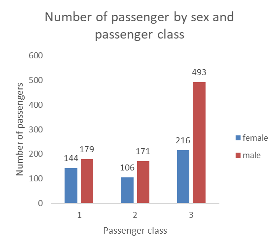
12.2.1.1 Side-by-side bars
The side-by-side bars have the benefit of being very clear and allow us to display the data label (this should be avoided, however, when there are two many bars and the numbers start getting to close to each other or overlapping. However, side-by-side bars can be less space efficient than stacked bars (see below) when dealing with categories with many groups.
12.2.1.2 Stacked bars
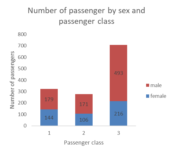
Stacking the bars can a nice option also. These graphs are more space efficient, but the data labels can be harder to read. The labels can also get crowded and start overlapping when categories have small number of observations.
One issue with stacked bars when we do not use data labels is that it becomes difficult to see which differences between the size of two bars that are on top of the others (in this case the difference between male passengers in the first and second classes would be hard to see if the number was not included).
12.2.1.3 100% stacked bars
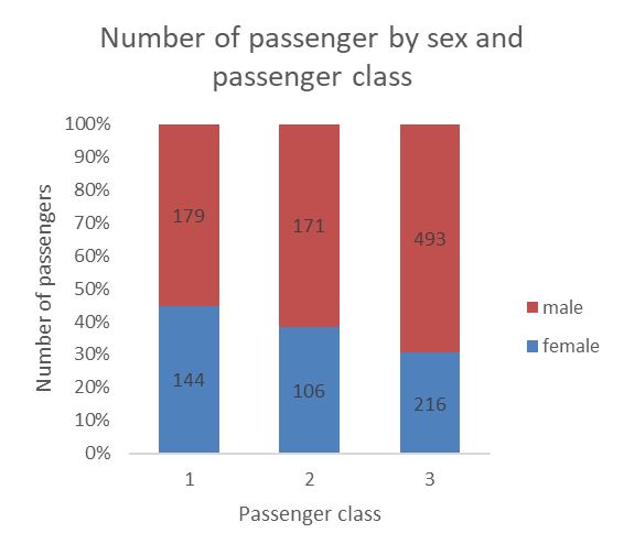
100% stacked bars actually allow you to reshape the bars by shaping them based on percentages, while still allowing you to show the count as the data label (unless you are working with aggregated data already in the form of percentages, then the data label would also show percentages).
12.2.1.4 Adding a third variable
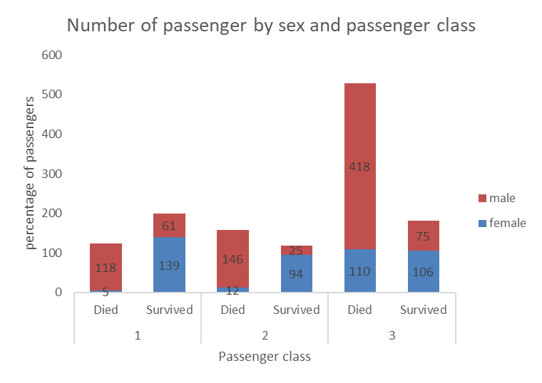
Sometimes, you may wish to add a third categorical variable in the mix. This is possible, as in the example below showing, for each passenger class, the number of passenger of each sex that survived or died.
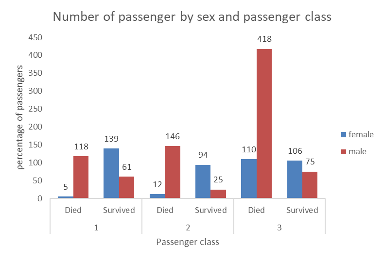
Here again, we can use stacked bars, however we can see that in some cases the numbers are small and overlap with the axes and are a bit harder to read. This is still a nice way to visualize the relationship between the three categorical variables (sex, survived, and passenger class).
12.2.2 Two numerical variables
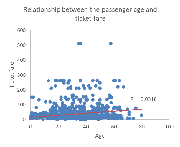
The go to graph when dealing with two numerical variables is the scatterplot, which displays each observation as a dot on the graph situated at coordinates determined by the two numerical variables. In the example below, we plotted the relationship between age and ticket fare. We also added a linear trend line and the R2 to help determine the direction and strength of the relationship between the two. Since the red line has a positive slope (it goes up as age and ticket fare increase, we can quickly see that the relationship is positive, and the low R2 value of 0.0318 tells confirms that the relationship is not strong. This is generally teh case when the dots do not seem to follow a regular pattern and are scattered all over and away from the trend line.
12.2.3 A numerical and a categorical variables
When dealing with a numerical and a categorical variables, we have two choices… we can produce a panel of histograms (one for each possible value of the categorical variable) or make a graph with multiple box plots (one for each value of the categorical variable).
The example below show a panel of three histograms (one for each passenger class) with the age distribution of Titanic passengers. This works pretty well, although it’s hard to see if there is a difference between the distribution for the second and third class. Another issue is that if that if we are working with a categorical variable with a lot of possible values, the amount of space needed to visualize each distribution may quickly become an issue.

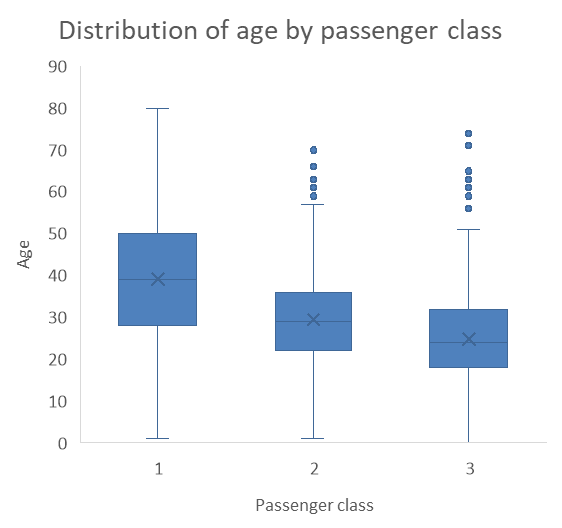
The two problems with histogram panels (the amount of space they take and the challenge in seeing differences) make the series of box plots an interesting alternative. As you can see, the example below is much more space efficient, and we can clearly see that the third class passengers tend to be younger then the second class passengers, who tend to be significantly younger than first class passengers. While they may not be the most popular visualization methods, box plots are a very clear and efficient way of visualizing distributions of a numerical variable for different groups.
12.2.4 Timelines
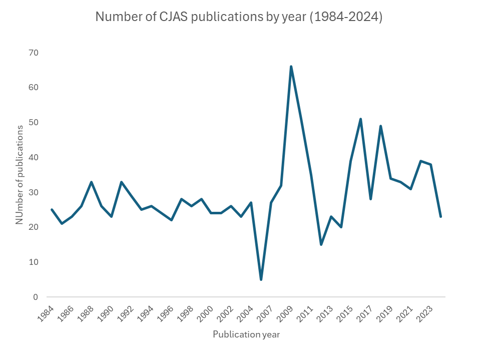
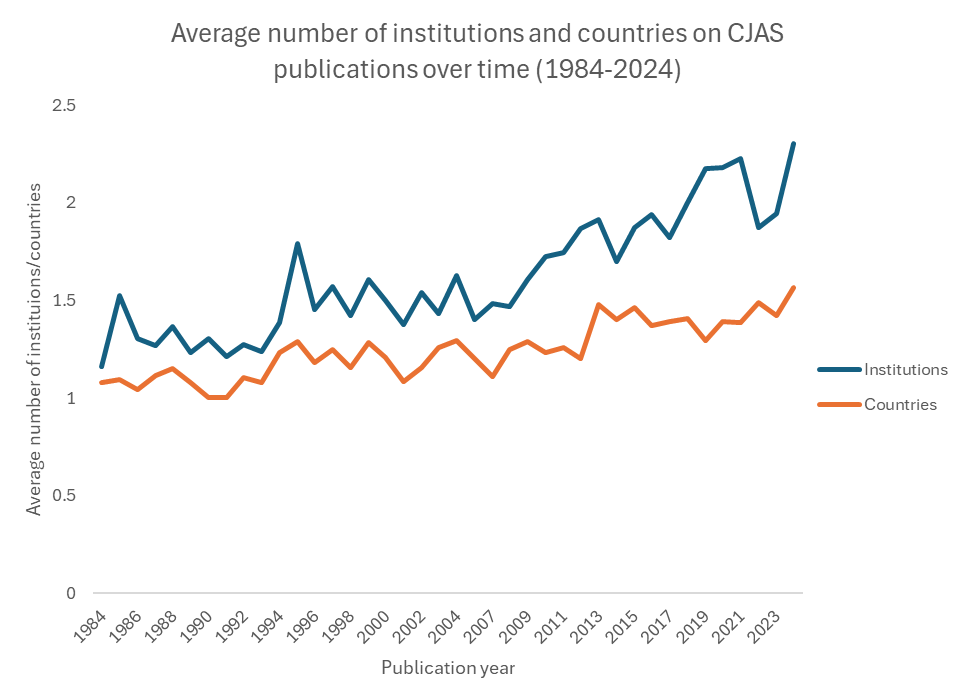
Finally, line graphs are preferred when one of the variable is a temporal unit (a date, a year, a day, etc.). In the example below, we observe the trend of the number of publications in the Canadian Journal of Administrative Sciences over four decades.
We can add multiple trends to in the same graph too. For example, the graph below shows the average number of institutions and countries listed on the publications in the journals, which indicate an increase in interinstitutional and international collaboration in the field over time.
That’s it, now you know how approach the visualization of multiple variables at once to show the relationship between them. The section below contains a series of videos demonstrating how to construct the graphs that you have encountered in this chapter (and a few more).